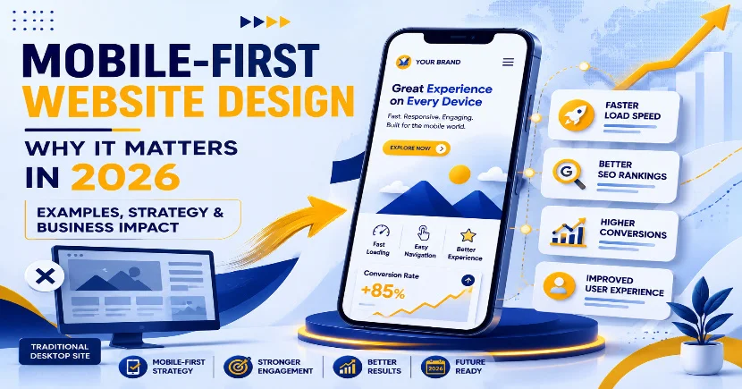
Introduction: The Mobile-First Reality That No Business Can Ignore in 2026
The simple truth driving the digital economy in 2026 is that mobile isn’t just another platform; it’s the main one.
People do not “switch” between devices anymore. Most digital adventures begin and end on smartphones. Whether you look for services, check prices, read reviews, make bookings, or buy stuff, it all begins on a phone. So, for web development company in Ahmedabad, offering a smooth mobile experience is key to grabbing, engaging, and converting customers.
This change in behavior has permanently altered website design, development, and optimization needs.
Ten years ago, businesses saw mobile sites as simplified versions of desktop ones. Things have changed though. This old view doesn’t work anymore. The mobile experience is now essential, not an extra. It’s the foundation of all online activities.
Search engines got on board completely. Take Google, for instance it switched to mobile-first indexing by default for ranking websites. So, your site’s mobile version decides your search visibility, not the desktop one.
Google’s official docs make it clear that mobile usability is crucial for indexing and ranking. They say this in their Google Search Central stuff about mobile-first indexing.
This shift isn’t just technical; it’s strategic. It impacts SEO, user interaction, conversion rates, and revenue as well, so it affects every part of a site’s success.
By 2026, websites won’t just be digital brochures; they’ll be essential business tools. We need to make sure they’re mobile-friendly from the get-go. So, let’s focus on designing them for smartphones and tablets right from the beginning.
Understanding Mobile-First Website Design (Beyond Basic Definitions) :
Mobile-first design is not just about making sites responsive.it’s also about prioritizing elements for mobile use.
So it ensures that content works perfectly on smaller screens too.
Instead of asking, a web design company in Ahmedabad focuses on mobiles first, then improves the design for all screen sizes, to ensure an optimal experience on any device.
Instead of asking:
“How do we fit this desktop design into mobile?”
Mobile-first asks:
“What does a mobile user actually need right now?”
This shift in thinking changes everything.
It forces businesses and developers to focus on:
- Essential content only
- Faster load performance
- Clear user journeys
- Minimal distractions
- Conversion-driven layouts
Creating sites for mobiles first isn’t just a choice anymore , it’s essential for making sure websites run smoothly in real-world situations.
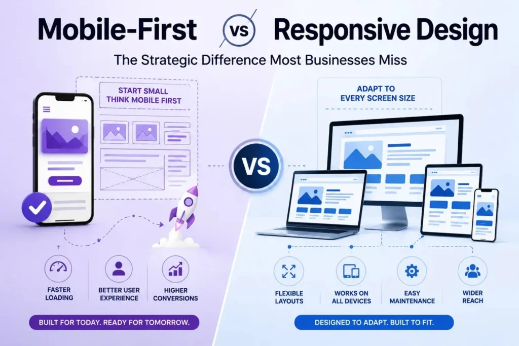
Mobile-First vs Responsive Design: The Strategic Difference Most Businesses Miss
Many businesses think responsive and mobile-first design are interchangeable, but they’re not. While related, these designs have distinct approaches and results. Companies must grasp these differences to pick what suits their objectives best.
Designers usually begin with the desktop layout for responsive design and tweak it for smaller screens using CSS. Yet, the mobile version often feels clunky because it’s merely adjusted from the desktop layout rather than being optimized specifically for mobile. Websites can end up crowded on smaller devices due to this approach.
Knowing these differences is key to ensuring smooth performance across all devices.
This choice affects website development costs in India too. Responsive design typically costs less upfront since it’s simpler, particularly for basic sites. A mobile-first approach requires more planning and initial spending, but it outperforms responsive design in scalability, performance, and long-term user satisfaction. So, the choice isn’t just about design; it affects your alignment with business goals and future growth.
Responsive Design
Responsive sites change their layout depending on the screen size, but they usually begin design from a desktop viewpoint..
Mobile-First Design
Mobile-first designs start with the smallest screen, making sure that both performance and usability are top priorities right from the start.
Here is a clear breakdown:
| Factor | Mobile-First Design | Responsive Design |
| Starting Point | Mobile constraints | Desktop layout |
| UX Priority | Behaviour-first | Layout-first |
| Performance | Built-in optimisation | Often added later |
| SEO Alignment | Strong with Google systems | Depends on execution |
| Scalability | High | Medium |
| Conversion Focus | High | Variable |
The real difference isn’t technical; it’s about strategic intent. Mobile-first design focuses on current user behavior, not the old school website structure, so it’s more in tune with how people actually use their phones.
Why Mobile-First Design Is Critical in 2026 ?
In 2026, user expectations are unforgiving.
If a website is slow, cluttered, or confusing, users do not “try again later” they leave immediately.
Modern users expect:
- Pages to load in under 2 seconds
- Instant clarity of information
- Smooth scrolling and navigation
- Zero friction during actions
- Minimal cognitive load
This behaviour has direct business consequences:
- Higher bounce rates
- Lower conversions
- Poor SEO performance
- Reduced brand trust
A skilled web development company in Ahmedabad gets these patterns and removes obstacles for smooth user experiences.
This approach isn’t just easier for users; it can also boost revenue.
Mobile Usage Statistics: Why the Shift Is Permanent :
Mobile usage dominance is not a trend, it is structural.
According to StatCounter Global Stats, mobile devices make up most of the world’s internet traffic.
Most folks won’t even see your desktop site first since many now use mobile devices to browse the web. This means the mobile design is what new visitors will see and judge your brand by initially. Search engines also care a lot about how well your site works on mobile, placing them higher if the mobile version is user-friendly. That makes having a great mobile experience really key for visibility and success. After all, engagement like clicks, time spent on site, and sales mostly comes from mobile users today.
In places like India, people frequently use smartphones first for going online and can get cheaper data too. This difference is really noticeable there.
So, for businesses, this means your mobile site is your main site, plain and simple.
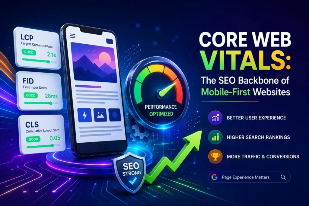
Core Web Vitals: The SEO Backbone of Mobile-First Websites
Mobile-first design rules SEO strategies because of its strong link to Core Web Vitals. It’s that simple really if you want to rank, you must optimize for mobile from the get-go.
Core Web Vitals judge real-user experience through three important signals :
- Loading performance (LCP)
- Interactivity (FID)
- Visual stability (CLS)
Google officially confirms that these signals are part of its ranking system.
In today’s mobile-first world, Core Web Vitals hugely impact search rankings and user happiness. A professional web design & development firm knows slow-loading sites, unresponsive pages, or stuff that shifts around too much make people leave. This increases bounce rates and cuts down on conversions. So, fixing these metrics isn’t just nice; it’s a must for anyone serious about their online biz. Great Core Web Vitals amp up SEO, boost trust and engagement, and better the whole mobile user experience.
Mobile-first design naturally improves these metrics because:
- It reduces unnecessary scripts and code
- Prioritises visible content first
- Minimises layout shifts
- Optimises media delivery
- Improves server response times
This leads to:
- Better rankings
- Higher engagement
- Lower bounce rates
- Improved conversions
In simple terms:
Better mobile performance = better SEO performance.
Success starts with the right digital partner.
Explore our services to see how Digifinity helps your business grow.
Explore Our ServiceRole of Modern Web Development in Mobile-First Success :
A modern web development company is not just a service provider.It’s a strategic growth partner.
A professional web developer makes businesses thrive by blending strategy, design, and speed. They ensure smooth online experiences, super crucial in our mobile-crazy world. Having just any site won’t cut it; nowadays, firms need quick, user-friendly mobile platforms. This is when talented developments and designers come in handy , they take sites from basic to perfectly optimized for mobile users.
A Web Design Company in Ahmedabad makes sites that work well in three key ways.
1. User Experience (UX)
They focus on seeing how users handle mobile interfaces and making smooth experiences for them.
2. Performance Engineering
Optimising speed, caching, code structure, and server performance.
3. SEO Architecture
To help search engines rank sites well, we should structure our websites for easy crawling and indexing by them. So they can efficiently evaluate the pages, we make this simple for the bots to navigate.
This includes integration with services like:
- SEO services
- Technical optimisation frameworks
- Content hierarchy planning
A skilled web development company makes sites super user-friendly by prioritizing easy navigation, quick loading times, and boosting mobile engagement. They start with a mobile-first approach, ensuring that layout, fonts, images, and interactions look great on small screens first, before tweaking for larger ones. This approach improves both user experience and SEO performance, including Core Web Vitals, which are key for top search engine rankings.
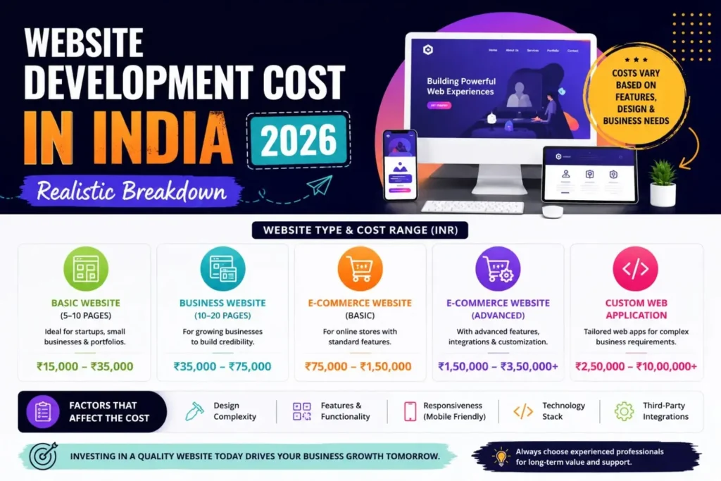
Website Development Cost in India (2026 Realistic Breakdown) :
Website development costs vary widely based on scope and complexity.
Standard Pricing Range:
- Basic websites: ₹15,000 – ₹50,000
- Business websites: ₹50,000 – ₹1,50,000
- Advanced platforms: ₹1,00,000 – ₹5,00,000+
While mobile-first development might boost initial costs a bit, it seriously cuts down on expenses over the long haul. So, it’s wise to consider this approach for its financial benefits in the long run.
Why?
- Fewer redesigns required
- Lower maintenance overhead
- Better SEO performance
- Higher conversion efficiency
What Actually Drives Pricing ?
Website pricing is not arbitrary. It is influenced by technical and strategic factors such as:
- UI/UX complexity
- Technology stack (React, Next.js, Laravel, etc.)
- Number of pages and content depth
- SEO integration level
- Performance optimisation requirements
- Backend functionality
Most businesses underestimate hidden long-term costs:
- SEO maintenance
- Performance upgrades
- Security updates
- Feature scaling
A digital strategy works best when it goes beyond just the launch. Building scalable systems and integrating SEO services in Ahmedabad also aids in long-term online growth and visibility.
How Mobile-First Design Improves UX and Conversion Rates ?
Mobile users act very differently from desktop users. They usually skim through the content and make quick decisions. Plus, they prefer tasks with simple steps. Also, they expect immediate responses when they land on a site. So, mobile-first UX design opts for clear calls-to-action, effortless navigation, and quick decision-making processes. This helps people easily find what they need, preventing confusion. Thus, it greatly increases engagement and conversion rates, making the overall experience smoother.
People want speedy, easy-to-use sites on their phones. So, mobile-first design lets them have that by cutting out extras, simplifying looks, and boosting speed. This lets folks easily find info, fill out forms, and buy things without frustration.
Businesses frequently use Performance Marketing Agency to bring in targeted, high-intent traffic. Mobile-first design is way more than just looking good on phones; it greatly affects how users interact and eventually buy something from your site. Since phone users behave differently than people on computers, making their needs a top priority leads to a smoother, faster experience. This approach improves crucial aspects of user experience and bumps up conversion rates noticeably
| Aspect | Mobile-First Design Impact |
| User Behavior Understanding | This design focuses on how mobile users really interact: quick scans, speedy decisions, and short focus spans. So it fits in well, making things easier for them. |
| User Experience (UX) | It offers neat designs, simple browsing, and focuses solely on what really counts, making it user-friendly and straightforward. |
| Website Speed | Optimized for faster loading on mobile devices, improving overall performance and satisfaction |
| Content Presentation | Prioritizes readability with simple structure, larger text, and reduced clutter |
| Navigation | Simpler menus and a more intuitive design make it easier for users to find info fast. So they don’t get confused or frustrated. |
| Call-to-Actions (CTAs) | Clear and visible CTAs improve user interaction and engagement |
| Conversion Rates | Faster decision-making and reduced friction lead to higher leads, sales, and sign-ups |
| Bounce Rate | Lower bounce rate due to better speed and improved user experience |
| Business Impact | Improves ROI by turning more mobile visitors into customers |
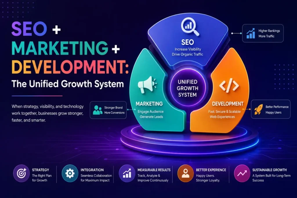
SEO + Marketing + Development: The Unified Growth System :
A high-performing website isn’t built in isolation.
It functions as part of a complete digital setup:
- SEO brings organic traffic
- SEM brings paid traffic
- Mobile-first UX converts users
When combined with Search Engine Marketing , businesses achieve a complete funnel optimisation system.
Real Business Impact of Mobile-First Websites:
Businesses adopting mobile-first design consistently see:
- 30–60% higher engagement rates
- Improved SEO rankings
- Lower bounce rates
- Higher lead conversions
- Stronger brand credibility
This is not theory, it is consistent across industries.
Choosing the Right Web Development Partner for Sustainable Growth :
Choosing the right partner is one of the most crucial business decisions you’ll make. So it’s essential to get it right. After all, partnerships can greatly influence success or failure.
Look for:
- Proven mobile-first portfolio
- Strong SEO expertise
- Performance optimisation capability
- Scalable architecture experience
- Transparent process
Hiring a professional agency makes sure your site actually grows your business, not just sits there looking pretty online.
Picking the right partner is crucial for your business’s success online. They don’t just build websites; they align with your goals, grasp your audience, and plot your future path. Given the cutthroat competition, nailing user experience and mobile performance is a must. So, opt for a company savvy with modern stuff like mobile-first design, performance enhancements, and SEO. This is what will help you grow. Also, review website development costs beforehand to ensure it fits your budget and meets your needs.
Future of Mobile-First Design Beyond 2026 :
AI tech is shifting from mobile-first to intelligent-first.
Future websites will be:
Predict User’s Intent
Dynamically personalize content
voice and visual search
Change layouts on-the-fly
McKinsey & Company in “The business value of design” explains how improved design and UX increase a company’s success. They note that firms that are practicing design thinking and UX have more satisfied customers, lower churn and faster revenue growth. The report shows that design-led companies outperform their competitors in experience ratings and profits. This is because they focus on making their products super intuitive, easy to use and just what customers want. So if companies want to win this competition, they should definitely pay more attention to the design.
Conclusion: Mobile-First Is the Foundation of Digital Growth
Design first for mobile. It’s a success online in 2026.
Mobile performance impacts everything from SEO to user experience and conversion rates. Based on real user behavior, top web developers in Ahmedabad help companies by creating sites that are quick, flexible, and search engine optimized.
If businesses ignore mobile-first practices in the cut-throat digital world, they will continue to lose out on visibility, traffic and revenue.